|
|
|
|
“The typeface of capitalism,” “the typeface of socialism,” a “dull blanket of sameness” – all
have been used to describe the popular typeface Helvetica. Producer/director Gary Hustwit tackles the seemingly
dull subject matter (a documentary about a font?) with surprising results – the most obvious being that it is hardly a tedious matter. I have to
admit, when I realized I would be reviewing a film about a font, I groaned a little. But exploring the relationship between Helvetica
and corporate control, Orwell-esque conformity, and Nazi Germany is anything but dull. A bit extreme, maybe, but fantastically insightful.
Created in 1957 by Swiss designer Max Miedinger, Helvetica offered a response to the busy, old-fashioned italics and exclamation points of previous
advertising methods. Complete with frilly loops and drawings, the full paragraph on why you should drink Coca-Cola became, under Helvetica’s
influence, “It’s the real thing. Coke.” Plain and simple, and a big hit with corporations. Helvetica is now the typeface for Verizon, Target,
Energizer, TNT, BMW, billboards, street signs, movie credits, album covers, this Web site, and IRS tax forms, becoming, as type designer
Erik Spiekermann puts it, “like air, it’s just there”.
Spiekermann’s intense dislike for Helvetica, comparing it to a militaristic regime, makes one think that if George Orwell or Aldous Huxley were
anal enough to describe the font used in the worlds of 1984 or Brave New World, it would have looked an awful lot like Helvetica. Graphic
designer Paula Scher is even more anti-Helvetica, protesting that it was both the typeface of the Vietnam War (when it was becoming popular with
big corporations supporting the conflict) and the current Iraq War. Even more so, the rigid cleanness of Helvetica possesses the strange power to
make her want to clean her room. Now that’s scary.
Not that the extreme prominence of a certain typeface is terrifically terrifying (I haven’t been chased by any Helvetica A’s or Helvetica Z’s in
my dreams yet), but it did raise an eyebrow when I realized just how widespread it is. At one point, graphic designer David Carson points to various
words typed in Helvetica and amusingly comments that the word “caffeinated” is “just sitting there, there’s nothing caffeinated about it” and
"where's the explosion" in "explosive"?
(Although, he does admit that Helvetica’s use in the logo for Greyhound is not far off.) In this sense, Hustwit’s film becomes more than just an
examination of a typeface. Questions on globalization, consumerism, and their effect on graphic design and creative individualism in general leave
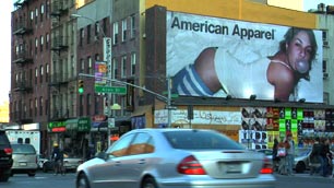
you much more curious about that new billboard around the corner. What exactly is being communicated besides legibility and cleaning your room?
DVD Extras: Bonus footage of Hustwit’s endless array of quirky interviewees. Worth watching for more insights and debate on graphic design and
typeface in general (and for the quirkiness, of course). B. Bastron
November 20, 2007